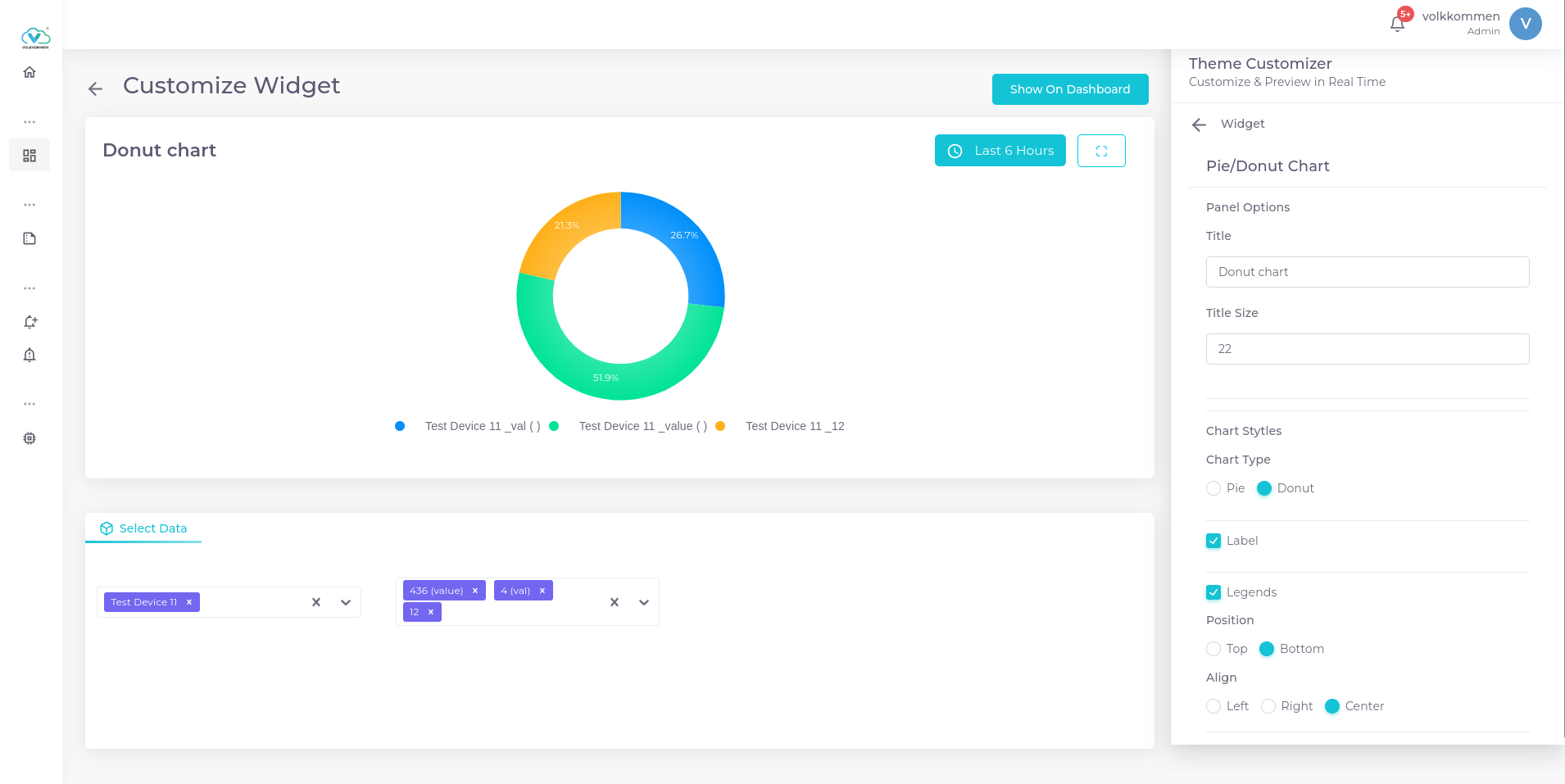
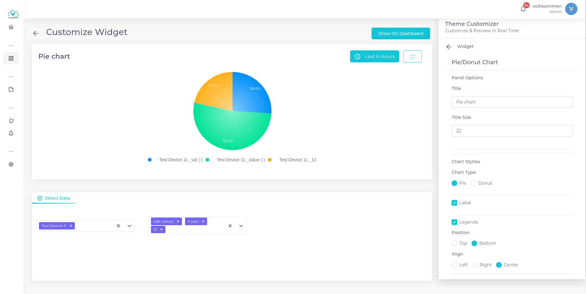
¶ Pie/Donut Chart
widget to show the contribution of each parameter.
¶ Overview
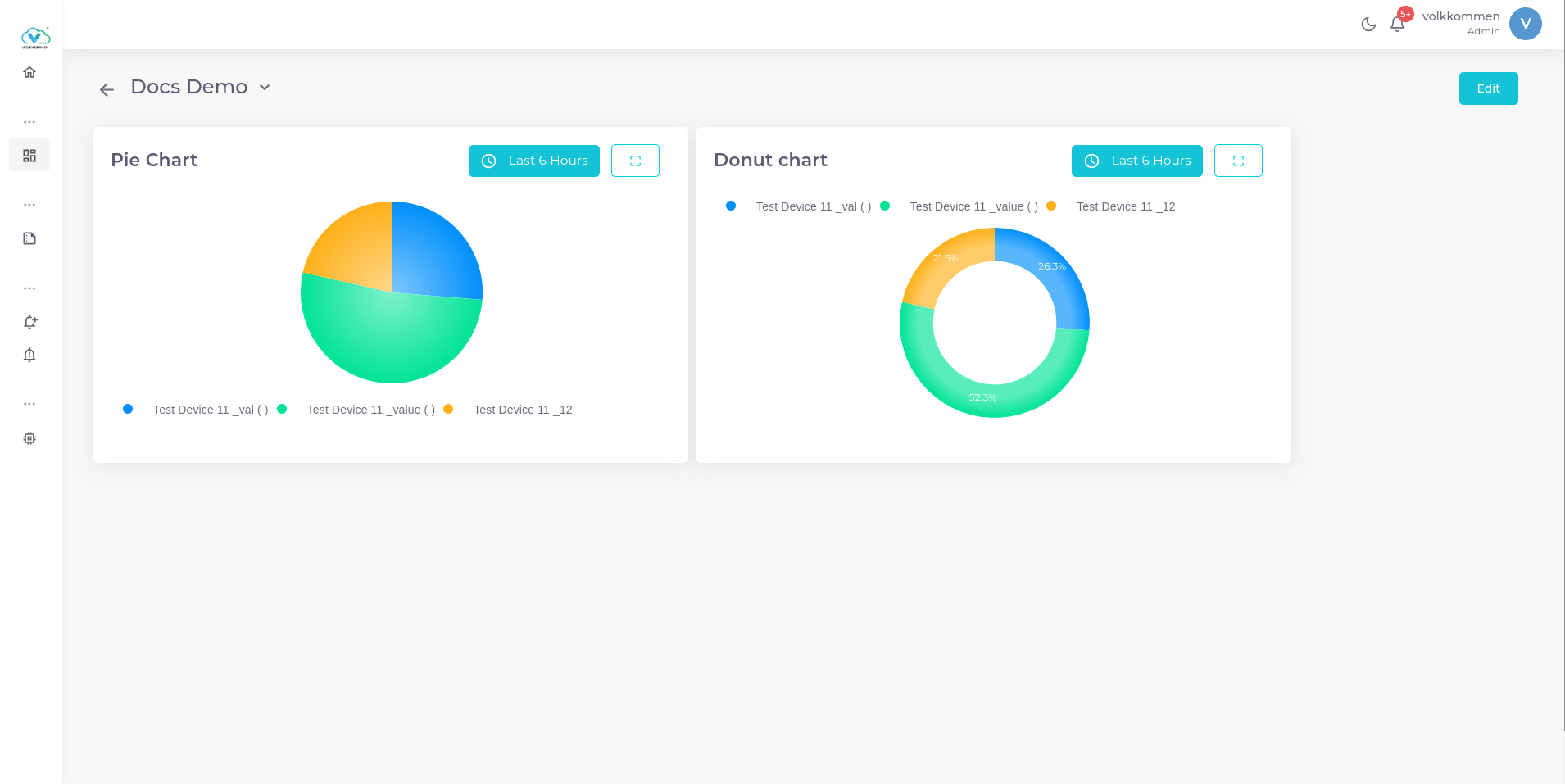
Pie charts and Donut charts are two powerful visualization tools used to compare multiple parameters effortlessly. They help in understanding the proportions of different values within a dataset at a glance.
¶ Data
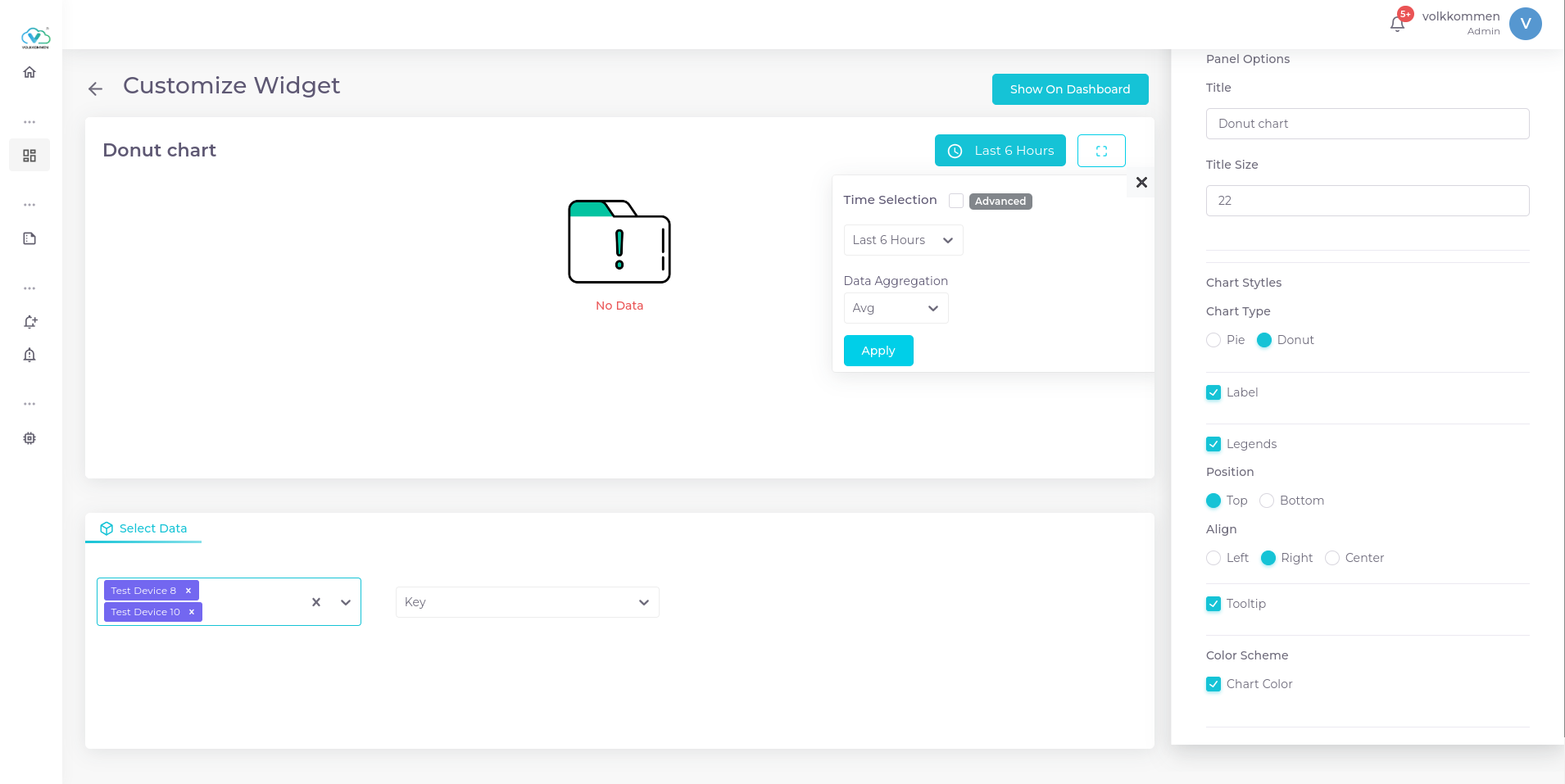
In both Pie and Donut charts, you can visualize multiple parameters. To select the data:
- Use the device selection and parameter selection at the bottom of the page to choose the device and parameter as per your requirements.
- The data shown in the Pie and Donut charts will be the aggregated values over a specific time period.
- Choose the aggregation function (such as Avg, Min, Max, or Sum) to summarize the data over the selected time range.
This allows you to effectively compare multiple parameters and their aggregated data in a simple, visual format.
¶ Configuration
The configuration options for both Donut and Pie charts are identical, with the only difference being their visual appearance. Here's how to configure them:
- Title Input Box – Enter the title for the chart.
- Chart Type Selection – Choose between Pie and Donut by selecting the corresponding radio button.
- Label Checkbox – If checked, the percentage contribution of each parameter will appear on top of each section of the chart.
- Legend Checkbox – If checked, the legend (parameter names and their colors) will be displayed.
- Choose to place the legend at the top, bottom, left, right, or center.
- Chart Color – If you want to assign specific colors to each parameter:
- Click Chart Color.
- Each parameter will appear with a color picker next to it.
- You can select a color from the wide variety available.
With these settings, you can customize the chart to display the data the way that best suits your needs.
-
Pie Chart
-
Donut Chart